Gotham Sans Serif Tobias Frere-Jones Designed fonts such as Whitney, and Surveyor Designed in 2000-09 Geometric Sans Serif extremely large family, featuring four widths, eight weights, and separate designs for screen display Old Style This category includes the first Roman types, originally created between the late 15th and mid 18th centuries, as well as typefaces patterned after those designed in this earlier period. The axis of curved strokes is normally inclined to the left in these designs, so that weight stress is at approximately 8:00 and 2:00 o’clock. The contrast in character stroke weight is not dramatic, and hairlines tend to be on the heavy side. Serifs are almost always bracketed in old style designs and head serifs are often angled. Some versions, like the earlier Venetian old style designs, are distinguished by the diagonal cross stroke of the lowercase e.
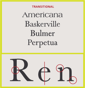
Transitional Serifs English printer and typographer John Baskerville established this style in the mid 18th century. These typefaces represent the transition between old style and neoclassical designs, and incorporate some characteristics of each. Baskerville’s work with calendered paper and improved printing methods (both developed by him) allowed much finer character strokes to be reproduced and subtler character shapes to be maintained. While the axis of curve strokes can be inclined in transitional designs, the strokes normally have a vertical stress. Weight contrast is more pronounced than in old style designs. Serifs are still bracketed and head serifs are oblique.
Modern
These are typefaces created within the late 18th century, or their direct descendants. The work of Giambattista Bodoni epitomizes this style of type. When first released, these typefaces were called “classical” designs. Early on, however, it became apparent to printers that these were not updated versions of classic type styles, but altogether new designs. As a result their classification name was changed to “modern.” Since the mid 20th century, they have also been classified as neoclassical or didone. Contrast between thick and thin strokes is abrupt and dramatic. The axis of curved strokes is vertical, with little or no bracketing. In many cases, stroke terminals are “ball” shapes rather than an evocation of a broad pen effect. These tend to be highly mannered designs, with clearly constructed letters.
Slab Serifs Slab serif typefaces became popular in the 19th century for advertising display. These typefaces have very heavy serifs with minimal or no bracketing. Generally, changes in stroke weight are imperceptible. To many readers, slab serif type styles look like sans serif designs with the simple addition of heavy (stroke weight) serifs.
Sans Serif
In typography, a sans-serif, sans serif, gothic, san serif or simply sanstypeface is one that does not have the small projecting features called "serifs" at the end of strokes.[1] The term comes from the French word sans, meaning "without" and "serif" from the Dutch word schreef meaning "line". Sans-serif fonts tend to have less line width variation than serif fonts.
In print, sans-serif fonts are often used for headlines rather than for body text.[2]
Sans-serif fonts have become the most prevalent for display of text on computer screens. This is partly because interlacedscreens have shown twittering on the fine details of the horizontal serifs. Additionally, on lower-resolution digital displays, fine details like serifs may disappear or appear too large.
Before the term "sans-serif" became common in English typography, a number of other terms had been used. One of these outmoded terms for sans serif was gothic, which is still used in East Asian typography and sometimes seen in font names like Century Gothic, Highway Gothic, or Trade Gothic.
Sans-serif fonts are sometimes, especially in older documents, used as a device for emphasis, due to their typically blacker type color.
Stroke Weight
The thickness of lines in a font character.
Axis
Imaginary top to bottom line
Small Caps
Caps that are shorter than height to regular caps
Lining Figures
All take up the same amount of width on a page
Non aligning Figures
Have ascenders and descenders
Ligatures
Two or more characters that are connected
Type Measurement
Has to do with the size of the type and why two types can be the same size in terms of number, but different sizes in how they appear


No comments:
Post a Comment