For my app I have decided to address the bad habit of draining phone batteries. It is very easy to drain ones phone battery when there are many apps running in the background that one is not aware of. I decided to dress this by creating an app that works as a notification system to notify the user when they have kept a specific app open for x amount of time or have kept y amount of apps open for z amount of time. This way the user has the ability to close down those apps before it affects their battery and leaves them without a phone to use for emergency purposes or files or information left on that phone the may be vital. I developed a simple wireframe for this app, because I want to make sure that this app is centered around the notifications rather than the in app interactions. I have begun the process of creating a logo for this app, and I am trying to center it around the battery icon seen on the top of ones smart phone. I am still exploring ways to make that connection more obvious.
Kylie Norton
Wednesday, November 9, 2016
Monday, October 31, 2016
Habits
Habit - a settled or regular tendency or practice, especially one that is hard to give up.
Habits are driven by a cue, a routine and a reward. This can be a bad habit, such as
Hunger - Eats Cookie - Cookie is enjoyed and you are no longer full
or a good habit
Wants to get in shape - works out - sees improvement
The key to breaking a habit is the reward element. By putting a reward into the equation there is a purpose behind something other than just dealing with the difficulty of breaking the habit. Another way that can break a habit is to alter the cue. If something stimulates this desire in the brain, moving away from that cue can cause someone to have no desire to repeat the habit
http://charlesduhigg.com/how-habits-work/
Wednesday, October 12, 2016
Game Process
Our game has come a long way since our first brainstorming session. In our brainstorming session we all agreed that creating a game that was fun and invoked people laughing at each other was the direction we wanted to move towards. We came up with ideas such as throwing treats into a dog cone, but we really liked the idea of someone running around with a donut on their head, so we stuck with that. We then worked to put together all of the materials and get everything set up. I worked in the laser cutter a lot laser cutting all of the donuts. The donut hat was made, the donuts were painted and the game was coming together. We then later had a trail run of the game and got to see some of the flaws that needed to be fixed. While the trial did go very well and accomplished a lot of the goals we had, we did find out that the donuts weren't sitting in the crown quite like we wanted and that we needed to cut down the amount of time and space used in the game. We fixed these by attaching velcro to the donuts so they would stick to the crown, cutting the time used down to 45 seconds and getting cones to predetermine the amount of space that could be used during game play.
Tuesday, September 27, 2016
Infographic Review
I really responded well to Naomi's infographic about fast fashion. She did a very good job making a large chunk of information and breaking it down, but still maintaining the downwards vertical flow. Her overall style clearly communicates her topic; I know immediately when I look at it that is revolving around the fashion world. She expressed her information from varying yet creative ways while still making an infographic that is aesthetically pleasing.
Monday, September 12, 2016
Infographic Thesis
There is a negative stigma that goes along with the word “feminist”, but very few people actually understand what that means. The term feminism is defined as “the belief in the political social and economic equality”. Many people would agree with the definition, but are scared off by the word. I want to make an infographic to show people’s relationship to feminism by showing who’s a feminist and who believes in feminist values, and shows the big gap in people who believe in feminism, but don't identify as feminist.
Wednesday, April 13, 2016
Speech Info
Speaker- Emma Watson
This speech brought feminism into the limelight. It defined what it was to those who might have had a stereotype of feminism and feminists in their heads and proved how feminism helps both women and men.
I feel like this is important and interesting because of how she showed the disadvantages women face and showed how men can benefit from feminism.
In this speech, Emma Watson is genuine, sincere and honest with her experiences as a woman, and is passionate about educating people of the true definition of feminism and how it can help the world.
Emma Watson speaks very slowly and deliberately through out her speech. She makes many pauses. She is firm, but does not raise her voice.
I believe that "I decided that I was a feminist" should be the section most emphasized from the speech.
The call to action is for more people (particularly men and boys) to identify as feminists and for people to open their eyes and see the systematic sexism in society that is very often unaddressed.
This speech makes me hopeful and inspired and I imagine that the audience felt the same way.
I could see people who are against feminism could see this as threatening or frustrating.
Emma Watson is an actress, most known for her role as Hermione in Harry Potter, but after Harry Potter finished, she graduated from Brown and became a spokesman for the campaign He for She. Today she is contemporary icon for the feminist movement.
Segment of the Speech-
For the record, feminism by definition is: “The belief that men and women should have equal rights and opportunities. It is the theory of the political, economic and social equality of the sexes.”
I started questioning gender-based assumptions when at eight I was confused at being called “bossy,” because I wanted to direct the plays we would put on for our parents—but the boys were not.
When at 14 I started being sexualized by certain elements of the press.
When at 15 my girlfriends started dropping out of their sports teams because they didn’t want to appear “muscly.”
When at 18 my male friends were unable to express their feelings.
I decided I was a feminist and this seemed uncomplicated to me. But my recent research has shown me that feminism has become an unpopular word.
Apparently I am among the ranks of women whose expressions are seen as too strong, too aggressive, isolating, anti-men and, unattractive.
Why is the word such an uncomfortable one?
https://www.youtube.com/watch?v=p-iFl4qhBsE
Tuesday, March 22, 2016
Poster Designers
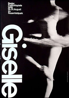
Armin Hofmann is a Swiss graphic designer. He began his career in 1947 as a teacher at the Allgemeine Gewerbeschule Basel School of Art and Crafts at the age of twenty-six. Hofmann followed Emil Ruder as head of the graphic design department at the Schule für Gestaltung Basel (Basel School of Design) and was instrumental in developing the graphic design style known as the Swiss Style. His teaching methods were unorthodox and broad based, setting new standards that became widely known in design education institutions throughout the world. His independent insights as an educator, married with his rich and innovative powers of visual expression, created a body of work enormously varied - books, exhibitions, stage sets, logotypes, symbols, typography, posters, sign systems, and environmental graphics. His work is recognized for its reliance on the fundamental elements of graphic form - point, line, and shape - while subtly conveying simplicity, complexity, representation, and abstraction.
Paula Scher (born October 6, 1948, Washington D.C) is an American graphic designer, painter and art educator in design, and the first female principal at Pentagram, which she joined in 199.1In 1972, she was hired by CBS Records to the advertising and promotions department. After two years, she left CBS Records to pursue a more creative endeavor at a competing label, Atlantic Records, where she became the art director, designing her first album covers. A year later Scher returned to CBS as an art director for the cover department.[2] During her eight years at CBS Records, she is credited with designing as many as 150 album covers a year. In 1991, after the studio suffered from the recession and Koppel took the position of Creative Director at Esquire magazine, Scher began consulting and joined Pentagram as a partner in the New York office.[2] Since then, she has been a principal at the New York office of the Pentagram design consultancy.[1]
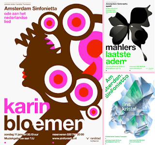
Studio Dumbar was founded by Gert Dumbar in 1977, in the Hague. In 2003, the studio moved to Rotterdam, as Michel de Boer took over the creative direction, after Gert Dumbar’s retirement. Studio Dumbar describes its work as ‘visual branding, online branding’, meaning that it creates every visible expression of a brand or organization — offline and online. Its international scope is reflected in its teams, with an average of seven nationalities in Rotterdam alone. Fragmented, sometimes complex to the edge of chaos, and layered with complex typography, many Dumbar projects caused consternation among advocates of a more ordered aesthetic. But by the late 1980s many European designers were mimicking Studio Dumbar’s approach, causing Gert Dumbar to place a moratorium on these techniques within his firm.
Paula Scher (born October 6, 1948, Washington D.C) is an American graphic designer, painter and art educator in design, and the first female principal at Pentagram, which she joined in 199.1In 1972, she was hired by CBS Records to the advertising and promotions department. After two years, she left CBS Records to pursue a more creative endeavor at a competing label, Atlantic Records, where she became the art director, designing her first album covers. A year later Scher returned to CBS as an art director for the cover department.[2] During her eight years at CBS Records, she is credited with designing as many as 150 album covers a year. In 1991, after the studio suffered from the recession and Koppel took the position of Creative Director at Esquire magazine, Scher began consulting and joined Pentagram as a partner in the New York office.[2] Since then, she has been a principal at the New York office of the Pentagram design consultancy.[1]
Josef Müller-Brockmann was a Swiss graphic designer and teacher. He studied architecture, design and history of art at both the University and Kunstgewerbeschule in Zürich. In 1936 he opened his Zurich studio specialising in graphic design, exhibition design and photography. From 1951 he produced concert posters for the Tonhalle in Zurich. In 1958 he became a founding editor of New Graphic Design and in 1966 he was appointed European design consultant to IBM.
He is recognised for his simple designs and his clean use of typography (notably Akzidenz-Grotesk), shapes and colours which inspire many graphic designers in the 21st century. Müller-Brockman was author of several books on design and visual communication.
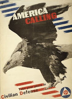
Herbert Matter was a Swiss-born American photographer and graphic designer known for his pioneering use of photomontage in commercial art. The designer's innovative and experimental work helped shape the vocabulary of 20th-century graphic design.
As a photographer, Matter won acclaim for his purely visual approach. A master technician, he used every method available to achieve his vision of light, form and texture. Manipulation of the negative, retouching, cropping, enlarging and light drawing are some of the techniques he used to achieve the fresh form he sought in his still lifes, landscapes, nudes and portraits. As a filmmaker he directed a film on his friend Alexander Calder (with music by John Cage) for the Museum of Modern Art in 1952.
Subscribe to:
Posts (Atom)


