Tuesday, October 27, 2015

Cake Research


Ingredients
2 cups sugar
1-3/4 cups all-purpose flour
3/4 cup HERSHEY’S Cocoa
1-1/2 teaspoons baking powder
1-1/2 teaspoons baking soda
1 teaspoon salt
2 eggs
1 cup milk
1/2 cup vegetable oil
2 teaspoons vanilla extract
“PERFECTLY CHOCOLATE” CHOCOLATE FROSTING (recipe follows)
Directions
1. Heat oven to 350°F. Grease and flour two 9-inch round baking pans.
2. Stir together sugar, flour, cocoa, baking powder, baking soda and salt in large bowl. Add eggs, milk, oil and vanilla; beat on medium speed of mixer 2 minutes. S3. Bake 30 to 35 minutes or until wooden pick inserted in center comes out clean. Cool 10 minutes; remove from pans to wire racks. Cool completely. 

1. Prepare the Cake 
It’s generally advisable to slice the two baked layers of an eight- or ten-inch cake into four layers. Make sure the cake is completely cool before slicing.

To do so, put one of the layers on a turntable or cardboard round and gently hold it in place with the palm of your hand.

Turn the cake against the edge of a serrated knife, making a small sawing motion with the knife. When the cake is cut all around about an inch in toward the center, repeat until the cake is cut through.

Support these thin layers with a cardboard round or a rimless baking sheet--never with your hands--when you lift them. Repeat with the other layer, so that you end up with four thin layers.

If a layer is domed, use the serrated knife to level it.

2. Use the Right Amount of Frosting
Too much frosting will overwhelm the cake and too little is disappointing.

Three to four cups of frosting generally is more than enough for an eight- or ten-inch layer cake.

The frosting should be at room temperature when you spread it on the cake, unless it’s whipped cream, which should be chilled.

The exceptions to these rules are the new pourable frostings on the market now. When you don’t have time or energy to make your own, these microwavable frostings are great and are designed to pour over warm cakes. In a hurry? Problem solved!

3. Begin with the Filling
Secure a cake layer to the turntable, cardboard round, or platter with a dab of frosting. Before setting the first cake layer on the dab of frosting, you might want to put four pieces of wax paper on the plate or turntable, positioned so that you can easily remove them from beneath the cake.

Spread the filling over the first layer and top with the next layer. Continue until all layers are stacked. You’ll need about a half cup of frosting per layer.

When the cake is filled and stacked, refrigerate it for 15 to 30 minutes for the filling to set.

4. Apply a Crumb Coat
It’s important to cover the cake with a thin layer of frosting called a crumb coat. This holds in the crumbs and makes it easier to apply the final coat.

Remove the filled cake from the refrigerator and brush away any loose crumbs from the top and sides of the cake.

Frost the sides of the cake first. Scoop up a generous dab of frosting onto a flat metal spatula and hold the spatula against the cake, perpendicular to the turntable. Move the spatula down and away from you without lifting it from the cake as you frost only a few inches.

Wipe excess crumbs and frosting from the spatula between applications of frosting. Scoop up another dab of frosting and continue around the cake.

When the sides are covered, spread an even layer of frosting over the top of the cake. (Some bakers frost the top before the sides.)

This initial layer of frosting should cover the sides and top of the cake, but does not have to look perfect.

At this point, refrigerate the cake for at least 20 minutes. This will give the frosting time to harden a little so that you can apply the final layer of frosting with ease.

5. Finish the Cake
Repeat this same procedure a second time, beginning with the sides and ending with the top of the cake.

You will be amazed at how easy it is to apply the second coat of frosting on top of a firm crumb coat. Always wipe the spatula clean every time you lift it from the cake.

Now is the time to make swirls and whirls with the frosting, or spread the frosting smoothly into a satiny sheath.

To spread buttercream frosting to its most silken smoothness, dip the spatula in hot water, wipe it dry, and run it lightly over the frosting. The warm metal will melt the frosting just enough to smooth it out.

For an especially luscious looking cake, apply three coats of frosting. If you do so, be sure to make more frosting than usual.

Sunday, October 18, 2015

[P3] 1

Gotham

Sans Serif

Tobias Frere-Jones
Designed fonts such as Whitney, and Surveyor
Designed in 2000-09
Geometric Sans Serif
 extremely large family, featuring four widths, eight weights, and separate designs for screen display

Old Style
This category includes the first Roman types, originally created between the late 15th and mid 18th centuries, as well as typefaces patterned after those designed in this earlier period. The axis of curved strokes is normally inclined to the left in these designs, so that weight stress is at approximately 8:00 and 2:00 o’clock. The contrast in character stroke weight is not dramatic, and hairlines tend to be on the heavy side. Serifs are almost always bracketed in old style designs and head serifs are often angled. Some versions, like the earlier Venetian old style designs, are distinguished by the diagonal cross stroke of the lowercase e.

Old Style Serifs

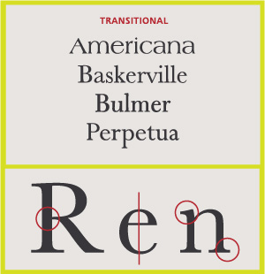
Transitional Serifs
English printer and typographer John Baskerville established this style in the mid 18th century. These typefaces represent the transition between old style and neoclassical designs, and incorporate some characteristics of each. Baskerville’s work with calendered paper and improved printing methods (both developed by him) allowed much finer character strokes to be reproduced and subtler character shapes to be maintained. While the axis of curve strokes can be inclined in transitional designs, the strokes normally have a vertical stress. Weight contrast is more pronounced than in old style designs. Serifs are still bracketed and head serifs are oblique.
Transitional Serifs


Modern
These are typefaces created within the late 18th century, or their direct descendants. The work of Giambattista Bodoni epitomizes this style of type. When first released, these typefaces were called “classical” designs. Early on, however, it became apparent to printers that these were not updated versions of classic type styles, but altogether new designs. As a result their classification name was changed to “modern.” Since the mid 20th century, they have also been classified as neoclassical or didone. Contrast between thick and thin strokes is abrupt and dramatic. The axis of curved strokes is vertical, with little or no bracketing. In many cases, stroke terminals are “ball” shapes rather than an evocation of a broad pen effect. These tend to be highly mannered designs, with clearly constructed letters.
Neoclassic & Didone Serifs


Slab Serifs
Slab serif typefaces became popular in the 19th century for advertising display. These typefaces have very heavy serifs with minimal or no bracketing. Generally, changes in stroke weight are imperceptible. To many readers, slab serif type styles look like sans serif designs with the simple addition of heavy (stroke weight) serifs.
Slab Serifs


Sans Serif
In typography, a sans-serifsans serifgothicsan serif or simply sans typeface is one that does not have the small projecting features called "serifs" at the end of strokes.[1] The term comes from the French word sans, meaning "without" and "serif" from the Dutch word schreef meaning "line". Sans-serif fonts tend to have less line width variation than serif fonts.
In print, sans-serif fonts are often used for headlines rather than for body text.[2]
Sans-serif fonts have become the most prevalent for display of text on computer screens. This is partly because interlacedscreens have shown twittering on the fine details of the horizontal serifs. Additionally, on lower-resolution digital displays, fine details like serifs may disappear or appear too large.
Before the term "sans-serif" became common in English typography, a number of other terms had been used. One of these outmoded terms for sans serif was gothic, which is still used in East Asian typography and sometimes seen in font names like Century GothicHighway Gothic, or Trade Gothic.
Sans-serif fonts are sometimes, especially in older documents, used as a device for emphasis, due to their typically blacker type color.

Stroke Weight
The thickness of lines in a font character. 

Axis
Imaginary top to bottom line

Small Caps
Caps that are shorter than height to regular caps

Lining Figures
All take up the same amount of width on a page

Non aligning Figures
Have ascenders and descenders

Ligatures
Two or more characters that are connected

Type Measurement
Has to do with the size of the type and why two types can be the same size in terms of number, but different sizes in how they appear


Wednesday, October 14, 2015

[P2] 7

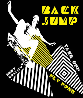
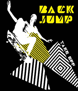
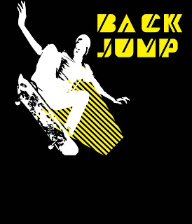
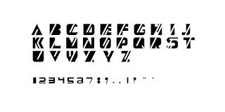
The purpose of this project was to create a typeface using FontStruct and then create a brochure and poster that effectively displayed the characteristics of the typeface through its design. I created the typeface, Back Jump, and got my inspiration through looking at different street art that can be found in big cities. I applied the bold, edgy and linear concepts that can be found in street art into my design. 

Edgy- This typeface pushes the orthodox letter forms
Linear- The consistent lines through the letters is a hallmark of Back Jump
Bold- The thickness of the characters gives this typeface a visible strength


Tuesday, October 13, 2015

[P2] 6


[P2] 5

Revisions


[P2] 4


[P2] 3

Linear- The consistently angled lines that go through the letters are what makes this typeface unique
Edgy- Because of the sharp angles and lines this font goes against the norm and rebels against what many other fonts do
Bold- This font uses a lot of positive space and is a very thick and wide typeface

[P2] 2

These are my beginning sketches and trials with Fonstruct. I struggled with the program a great deal, but I was still able to get some pretty cool concepts out of it. The most difficult aspect of it was having a big idea for a font but being limited because of the abilities of the program.