Sunday, January 31, 2016

Grid Questions

What are the advantages of a multiple column grid? 
Some of the advantages of a multiple column grid include the better ability to establish hierarchy through the inclusion of multiple elements such as text, images and quotes.
How many characters is optimal for a line length? words per line?
The ideal number of characters per line would be about 50-60 or 9-12 words.
Why is the baseline grid used in design?
You use a baseline grid to create a rhythm through type size and leading.
What are reasons to set type justified? ragged (unjustified)?
Why someone would set type justified is to create a clean edge around the text box and better use the space of the page. Ragged text is more organic and natural and doesn't leave awkward gaps within the text when you justify
What is a typographic river?
Thats when there are gaps that line us and flow down the text.
What does clothesline, hang-line or flow line mean?
This is for captions or headers and creates a consistent space throughout the spreads
What is type color/texture mean?
Type color shows contrast within a spread out body of text. Texture is made through different typefaces.

How does x-height effect type color?
The larger the x height, the more the colors stand out and appear bolder. The smaller the x height, the lighter the colors will appear.
What are some ways to indicate a new paragraph. Are there any rules?
A new paragraph can be indicated by indents, outdents and space. One rule is to not start a new paragraph and indent it.


Tuesday, January 26, 2016

Steven Meisel Presentation


6 Designers

Fred Woodward

Fred Woodward has contributed a lot to graphic design but he is especially known for what he contributed during his time working for Rolling Stone. He worked for the magazine from the year 1987 to 2001 and largely changed its visual style. He made it more expressive and eclectic, showing both modernism and American vernacular. He showed this through fat woodblock display faces and a weathered color palette. He received much inspiration from 19th century playbills.


Gail Anderson

Gail Anderson worked from 1987 to 2002 as the senior art director for the Rolling Stone. While she was there she did work with Fred Woodward making the Rolling Stone into a magazine with modernistic and eclectic style. She also worked at Spot Co as a creative director. There she worked with advertising for arts and entertainment.  She stayed there until 2010 when she left to be a partner at Anderson Newton Design.


Tibor Kalman

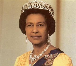
Tibor Kalman worked for the Benetton-sponsored Colors magazine as the founding editor in chief. His focus in this magazine was multiculturalism and global awareness. He wanted this magazine to be about the rest of the world. The design hat he used was very bold, and he often used very recognizable figures in his articles. One of his articles included Queen Elizabeth and the Pope as racial minorities. He also did design work through M&Co. which he worked on before and after his time at Colors.


Alexi Brodovitch

Alexi Brodovitch was a russian photographer and graphic designer who did some of his most notable work for Harper’s Bazaar in the mid 30’s to late 50’s. Brodovitch felt that combining elegance with innovation would create the best design for Harper’s Bazaar. He also experienced with surrealism in his works as well. In his time color magazines were considered new and luxurious, so he was able to experiment with that to give the magazine a very high class, expensive feel.


Neville Brody

Neville Brody is most noted for his contributions to The Face magazine from 1981-1986 as well as Arena which he worked on from 1987-1990. He also founded the company Research Studios and is a founding member of Fontworks. His work was usually very experimental and changing with the times. He has also created many typefaces through Fontworks. 


David Carson

David Carson a graphic designer from America. He is best known for his innovative magazine design, and use of experimental typography. He was the art director for the magazine Ray Gun, in which he employed much of the typographic and layout style for which he is known. In particular, his widely imitated aesthetic defined the so-called "grunge typography" era.