Tuesday, October 13, 2015
[P2] 3
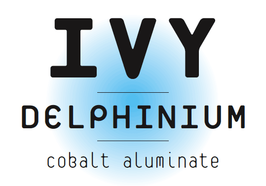
Linear- The consistently angled lines that go through the letters are what makes this typeface unique
Edgy- Because of the sharp angles and lines this font goes against the norm and rebels against what many other fonts do
Bold- This font uses a lot of positive space and is a very thick and wide typeface
Edgy- Because of the sharp angles and lines this font goes against the norm and rebels against what many other fonts do
Bold- This font uses a lot of positive space and is a very thick and wide typeface
Monday, September 28, 2015
[P2]:1
Garamond was designed by Claude Garamond in the 16th century. It is considered to be a typeface that is formal, classic and highly legible. It was created for use in the book Paraphrasis in Elegantiarum Libros Laurentii Vallae. The only complete set of the original is in a museum in Belgium. Garamond has underwent some changes as time moved on, but many of its characteristics remain the same.
Serifa was designed by Adrian Frutiger in 1964. It is considered to be a typeface that is bold geometric and identifiable. It is considered a slab serif font because of its thick serifs. It was originally based on Univers, but took on its own personality. It is a very good font for commanding space and emphasis.
Platelet was designed by students in 1992. It is considered to be a typeface that is futuristic, quirky and strong. It was inspried by the font used on licence plates. It initally only conatined only lower case letters, but that was later changed so it could be more widely used.
Serifa was designed by Adrian Frutiger in 1964. It is considered to be a typeface that is bold geometric and identifiable. It is considered a slab serif font because of its thick serifs. It was originally based on Univers, but took on its own personality. It is a very good font for commanding space and emphasis.
Platelet was designed by students in 1992. It is considered to be a typeface that is futuristic, quirky and strong. It was inspried by the font used on licence plates. It initally only conatined only lower case letters, but that was later changed so it could be more widely used.
Wednesday, September 16, 2015
Designers
Paul Rand
Paul Rand was
an American graphic designer who is most known for his corporate logo designs
including logos for ABC, UPS and IBM. He is also known for being one of the
first Americans to use Swiss design in his works.
Saul Bass
Saul bass was
an American graphic designer known for his designs of title sequences, film
posters and corporate logos. Some of his well-known work can be seen in Alfred
Hitchcock films such as North by Northwest and Psycho. He also designed logos
for companies like AT&T and United Airlines.
Massimo Vignelli
Massimo Vignelli was an Italian graphic designer who worked in New York and was known for his mantra "If you can design one thing, you can design everything," He is known for his work in the identity of American Airlines and the New York and DC subway maps.
Milton Glaser
Milton Glaser is an American graphic designer native to New
York who designed album covers for artists like Bob Dylan. He also designed the
I <3 NY logo that can be seen through out sections of New York that are visited
by tourists.
Stefan Sagmeister
Austrian graphic designer Stefan Sagmeister is known for his album and movie poster
designs. Some notable clients include The Rolling Stones and Aerosmith.
Paula Scher
Paula Scher is an American graphic designer and first female principle
at Pentagram. She has worked with notable companies such as CBS and Atlantic
Records.
Adrian Frutiger
Adrian Frutiger is a
heavily influential designer and very well known for the typefaces he created
in his life. He also played a key role in the movement of typography onto a
digital medium. Some of these type faces that he created included Univers, Frutiger and Avenir. These typefaces are some of the most used and
well known typefaces he had created. He considered his "main life's
work" to be the creation of sans-serif types.
Adrian
Frutiger was born in Unterseen, Swiserland. As a boy his passion for typography
was sparked by his experimentation with stylized handwriting as a way for him
to rebel against his strict penmanship classes. At 16 he began his apprenticeship
The training
of Adrian Frutiger varied from apprenticeships, attendance of Swiss design
schools,concentrating in calligraphy, and studying under designers such as Walter
Käch, Karl Schmid and Alfred Willimann
When
creating Univers, Adrian Frutiger envisioned a simple easy to read font that
also had a large font family that had the potential to be used in a variety of
settings. Univers was highly influential in his creation of other fonts including
Serifa and Glypha. Adrian Frutiger died recently on September 10th
in Bremgarten bei Bern, Switzerland
Subscribe to:
Posts (Atom)