Wednesday, November 9, 2016

Battery Saver Progress


For my app I have decided to address the bad habit of draining phone batteries. It is very easy to drain ones phone battery when there are many apps running in the background that one is not aware of. I decided to dress this by creating an app that works as a notification system to notify the user when they have kept a specific app open for x amount of time or have kept y amount of apps open for z amount of time. This way the user has the ability to close down those apps before it affects their battery and leaves them without a phone to use for emergency purposes or files or information left on that phone the may be vital. I developed a simple wireframe for this app, because I want to make sure that this app is centered around the notifications rather than the in app interactions. I have begun the process of creating a logo for this app, and I am trying to center it around the battery icon seen on the top of ones smart phone. I am still exploring ways to make that connection more obvious. 


Monday, October 31, 2016

Habits

Habit - a settled or regular tendency or practice, especially one that is hard to give up.
Habits are driven by a cue, a routine and a reward. This can be a bad habit, such as
Hunger - Eats Cookie - Cookie is enjoyed and you are no longer full
or a good habit
Wants to get in shape - works out - sees improvement

The key to breaking a habit is the reward element. By putting a reward into the equation there is a purpose behind something other than just dealing with the difficulty of breaking the habit. Another way that can break a habit is to alter the cue. If something stimulates this desire in the brain, moving away from that cue can cause someone to have no desire to repeat the habit

http://charlesduhigg.com/how-habits-work/

Wednesday, October 12, 2016

Game Process

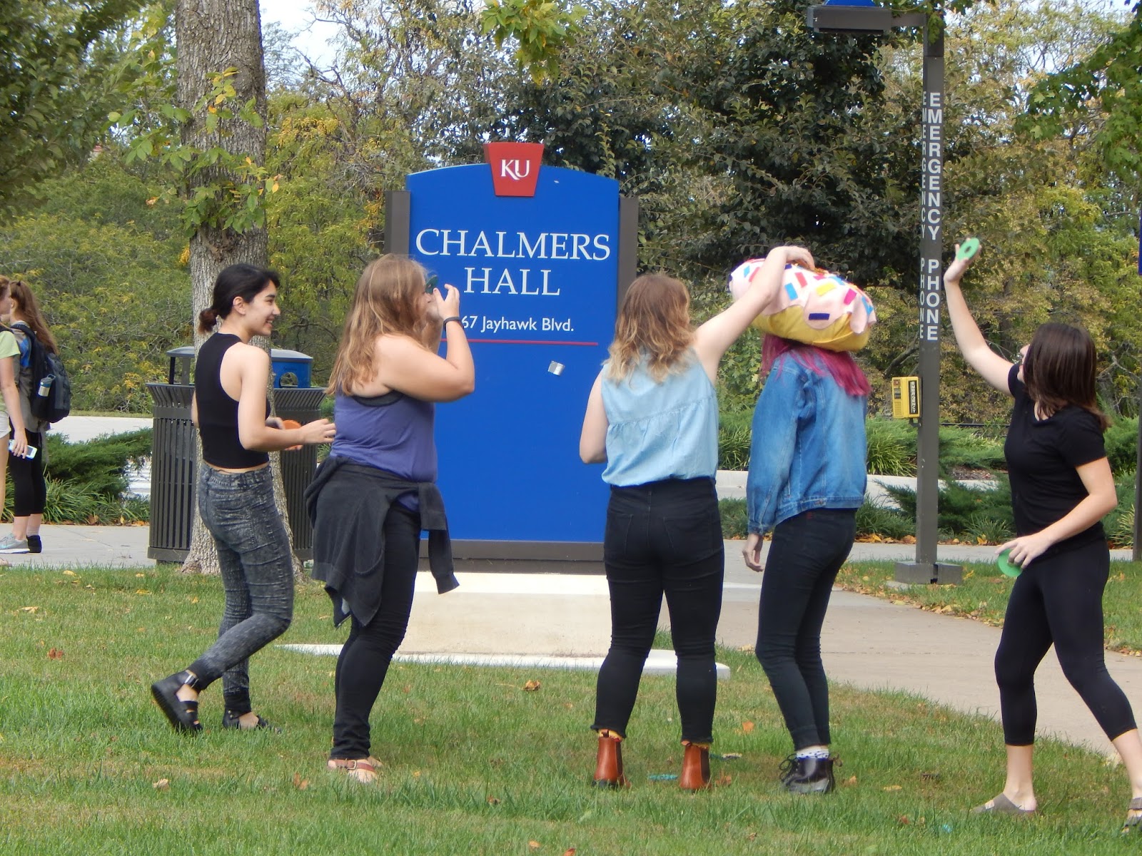
Our game has come a long way since our first brainstorming session. In our brainstorming session we all agreed that creating a game that was fun and invoked people laughing at each other was the direction we wanted to move towards. We came up with ideas such as throwing treats into a dog cone, but we really liked the idea of someone running around with a donut on their head, so we stuck with that. We then worked to put together all of the materials and get everything set up. I worked in the laser cutter a lot laser cutting all of the donuts. The donut hat was made, the donuts were painted and the game was coming together. We then later had a trail run of the game and got to see some of the flaws that needed to be fixed. While the trial did go very well and accomplished a lot of the goals we had, we did find out that the donuts weren't sitting in the crown quite like we wanted and that we needed to cut down the amount of time and space used in the game. We fixed these by attaching velcro to the donuts so they would stick to the crown, cutting the time used down to 45 seconds and getting cones to predetermine the amount of space that could be used during game play.


Tuesday, September 27, 2016

Infographic Review

I really responded well to Naomi's infographic about fast fashion. She did a very good job making a large chunk of information and breaking it down, but still maintaining the downwards vertical flow. Her overall style clearly communicates her topic; I know immediately when I look at it that is revolving around the fashion world. She expressed her information from varying yet creative ways while still making an infographic that is aesthetically pleasing.

Monday, September 12, 2016

Infographic Thesis


There is a negative stigma that goes along with the word “feminist”, but very few people actually understand what that means. The term feminism is defined as “the belief in the political social and economic equality”. Many people would agree with the definition, but are scared off by the word. I want to make an infographic to show people’s relationship to feminism by showing who’s a feminist and who believes in feminist values, and shows the big gap in people who believe in feminism, but don't identify as feminist.


Wednesday, April 13, 2016

Speech Info

Speaker- Emma Watson

This speech brought feminism into the limelight. It defined what it was to those who might have had a stereotype of feminism and feminists in their heads and proved how feminism helps both women and men. 

I feel like this is important and interesting because of how she showed the disadvantages women face and showed how men can benefit from feminism.

In this speech, Emma Watson is genuine, sincere and honest with her experiences as a woman, and is passionate about educating people of the true definition of feminism and how it can help the world.

Emma Watson speaks very slowly and deliberately through out her speech. She makes many pauses. She is firm, but does not raise her voice.

I believe that "I decided that I was a feminist" should be the section most emphasized from the speech. 

The call to action is for more people (particularly men and boys) to identify as feminists and for people to open their eyes and see the systematic sexism in society that is very often unaddressed. 

This speech makes me hopeful and inspired and I imagine that the audience felt the same way.

I could see people who are against feminism could see this as threatening or frustrating. 

Emma Watson is an actress, most known for her role as Hermione in Harry Potter, but after Harry Potter finished, she graduated from Brown and became a spokesman for the campaign He for She. Today she is contemporary icon for the feminist movement. 


Segment of the Speech-

For the record, feminism by definition is: “The belief that men and women should have equal rights and opportunities. It is the theory of the political, economic and social equality of the sexes.” 
I started questioning gender-based assumptions when at eight I was confused at being called “bossy,” because I wanted to direct the plays we would put on for our parents—but the boys were not. 
When at 14 I started being sexualized by certain elements of the press. 
When at 15 my girlfriends started dropping out of their sports teams because they didn’t want to appear “muscly.” 
When at 18 my male friends were unable to express their feelings. 
I decided I was a feminist and this seemed uncomplicated to me. But my recent research has shown me that feminism has become an unpopular word. 
Apparently I am among the ranks of women whose expressions are seen as too strong, too aggressive, isolating, anti-men and, unattractive.
Why is the word such an uncomfortable one?

https://www.youtube.com/watch?v=p-iFl4qhBsE

(I am going to shorten this down)

Tuesday, March 22, 2016

Poster Designers

Armin Hofmann is a Swiss graphic designer. He began his career in 1947 as a teacher at the Allgemeine Gewerbeschule Basel School of Art and Crafts at the age of twenty-six. Hofmann followed Emil Ruder as head of the graphic design department at the Schule für Gestaltung Basel (Basel School of Design) and was instrumental in developing the graphic design style known as the Swiss Style. His teaching methods were unorthodox and broad based, setting new standards that became widely known in design education institutions throughout the world. His independent insights as an educator, married with his rich and innovative powers of visual expression, created a body of work enormously varied - books, exhibitions, stage sets, logotypes, symbols, typography, posters, sign systems, and environmental graphics. His work is recognized for its reliance on the fundamental elements of graphic form - point, line, and shape - while subtly conveying simplicity, complexity, representation, and abstraction.


Studio Dumbar was founded by Gert Dumbar in 1977, in the Hague. In 2003, the studio moved to Rotterdam, as Michel de Boer took over the creative direction, after Gert Dumbar’s retirement. Studio Dumbar describes its work as ‘visual branding, online branding’, meaning that it creates every visible expression of a brand or organization — offline and online. Its international scope is reflected in its teams, with an average of seven nationalities in Rotterdam alone. Fragmented, sometimes complex to the edge of chaos, and layered with complex typography, many Dumbar projects caused consternation among advocates of a more ordered aesthetic. But by the late 1980s many European designers were mimicking Studio Dumbar’s approach, causing Gert Dumbar to place a moratorium on these techniques within his firm.


Paula Scher (born October 6, 1948, Washington D.C) is an American graphic designer, painter and art educator in design, and the first female principal at Pentagram, which she joined in 199.1In 1972, she was hired by CBS Records to the advertising and promotions department. After two years, she left CBS Records to pursue a more creative endeavor at a competing label, Atlantic Records, where she became the art director, designing her first album covers. A year later Scher returned to CBS as an art director for the cover department.[2] During her eight years at CBS Records, she is credited with designing as many as 150 album covers a year. In 1991, after the studio suffered from the recession and Koppel took the position of Creative Director at Esquire magazine, Scher began consulting and joined Pentagram as a partner in the New York office.[2] Since then, she has been a principal at the New York office of the Pentagram design consultancy.[1]


Josef Müller-Brockmann was a Swiss graphic designer and teacher. He studied architecture, design and history of art at both the University and Kunstgewerbeschule in Zürich. In 1936 he opened his Zurich studio specialising in graphic design, exhibition design and photography. From 1951 he produced concert posters for the Tonhalle in Zurich. In 1958 he became a founding editor of New Graphic Design and in 1966 he was appointed European design consultant to IBM.
He is recognised for his simple designs and his clean use of typography (notably Akzidenz-Grotesk), shapes and colours which inspire many graphic designers in the 21st century. Müller-Brockman was author of several books on design and visual communication.


Herbert Matter was a Swiss-born American photographer and graphic designer known for his pioneering use of photomontage in commercial art. The designer's innovative and experimental work helped shape the vocabulary of 20th-century graphic design.
As a photographer, Matter won acclaim for his purely visual approach. A master technician, he used every method available to achieve his vision of light, form and texture. Manipulation of the negative, retouching, cropping, enlarging and light drawing are some of the techniques he used to achieve the fresh form he sought in his still lifes, landscapes, nudes and portraits. As a filmmaker he directed a film on his friend Alexander Calder (with music by John Cage) for the Museum of Modern Art in 1952.


Monday, February 22, 2016

Abbott Miller Article Summary


Abbott Miller is a graphic designer who has witnessed the evolution that graphic design has experienced over the last few decades. He says that there is much more of a reliance on logos now and that he doesn’t like how people just plop it onto things. He believes that the logo should be one piece of a brands overall identity. 
He also commented on how technology has changed graphic design and allowed more people to be better informed on typography. The importance of design is also something that has been more widely known. He says that people are almost seeing design as too important a component of their products. He also commented about how much he enjoys how social team orientated design is. He enjoys being able to work with others to design his products.

Sunday, January 31, 2016

Grid Questions

What are the advantages of a multiple column grid? 
Some of the advantages of a multiple column grid include the better ability to establish hierarchy through the inclusion of multiple elements such as text, images and quotes.
How many characters is optimal for a line length? words per line?
The ideal number of characters per line would be about 50-60 or 9-12 words.
Why is the baseline grid used in design?
You use a baseline grid to create a rhythm through type size and leading.
What are reasons to set type justified? ragged (unjustified)?
Why someone would set type justified is to create a clean edge around the text box and better use the space of the page. Ragged text is more organic and natural and doesn't leave awkward gaps within the text when you justify
What is a typographic river?
Thats when there are gaps that line us and flow down the text.
What does clothesline, hang-line or flow line mean?
This is for captions or headers and creates a consistent space throughout the spreads
What is type color/texture mean?
Type color shows contrast within a spread out body of text. Texture is made through different typefaces.

How does x-height effect type color?
The larger the x height, the more the colors stand out and appear bolder. The smaller the x height, the lighter the colors will appear.
What are some ways to indicate a new paragraph. Are there any rules?
A new paragraph can be indicated by indents, outdents and space. One rule is to not start a new paragraph and indent it.


Tuesday, January 26, 2016

Steven Meisel Presentation


6 Designers

Fred Woodward

Fred Woodward has contributed a lot to graphic design but he is especially known for what he contributed during his time working for Rolling Stone. He worked for the magazine from the year 1987 to 2001 and largely changed its visual style. He made it more expressive and eclectic, showing both modernism and American vernacular. He showed this through fat woodblock display faces and a weathered color palette. He received much inspiration from 19th century playbills.


Gail Anderson

Gail Anderson worked from 1987 to 2002 as the senior art director for the Rolling Stone. While she was there she did work with Fred Woodward making the Rolling Stone into a magazine with modernistic and eclectic style. She also worked at Spot Co as a creative director. There she worked with advertising for arts and entertainment.  She stayed there until 2010 when she left to be a partner at Anderson Newton Design.


Tibor Kalman

Tibor Kalman worked for the Benetton-sponsored Colors magazine as the founding editor in chief. His focus in this magazine was multiculturalism and global awareness. He wanted this magazine to be about the rest of the world. The design hat he used was very bold, and he often used very recognizable figures in his articles. One of his articles included Queen Elizabeth and the Pope as racial minorities. He also did design work through M&Co. which he worked on before and after his time at Colors.


Alexi Brodovitch

Alexi Brodovitch was a russian photographer and graphic designer who did some of his most notable work for Harper’s Bazaar in the mid 30’s to late 50’s. Brodovitch felt that combining elegance with innovation would create the best design for Harper’s Bazaar. He also experienced with surrealism in his works as well. In his time color magazines were considered new and luxurious, so he was able to experiment with that to give the magazine a very high class, expensive feel.


Neville Brody

Neville Brody is most noted for his contributions to The Face magazine from 1981-1986 as well as Arena which he worked on from 1987-1990. He also founded the company Research Studios and is a founding member of Fontworks. His work was usually very experimental and changing with the times. He has also created many typefaces through Fontworks. 


David Carson

David Carson a graphic designer from America. He is best known for his innovative magazine design, and use of experimental typography. He was the art director for the magazine Ray Gun, in which he employed much of the typographic and layout style for which he is known. In particular, his widely imitated aesthetic defined the so-called "grunge typography" era.


Wednesday, December 9, 2015

[P4] 4


[P4] 3


This is the board with all of my trial and error letter forms. I experimented with script type faces, but ultimately did not like them, so i focused more on San-serifs. My favorite was the letter forms from Univers. 
Here are the final letter forms from each typeface that I worked with. 


[P4] 2


Monday, November 16, 2015

[P4] 1

RESEARCH
Seattle is a West Coast seaport city and the seat of King County. With an estimated 662,400 residents as of 2015, Seattle is the largest city in both the state of Washington and the Pacific Northwest region of North America. As of July 2013 it was the fastest-growing major city in the United States, and remained in the top five in May 2015 with an annual growth rate of 2.1%. The Seattle metropolitan area of around 3.6 million inhabitants is the 15th largest metropolitan area in the United States. The city is situated on a narrow isthmus between Puget Sound (an inlet of the Pacific Ocean) and Lake Washington, about 100 miles (160 km) south of the Canada–United States border. A major gateway for trade with Asia, Seattle is the 8th largest port in the United States and 9th largest in North America in terms of container handling.
The Seattle area was previously inhabited by Native Americans for at least 4,000 years before the first permanent European settlers. Arthur A. Denny and his group of travelers, subsequently known as the Denny Party, arrived from Illinois via Portland, Oregon on the schooner Exact at Alki Point on November 13, 1851. The settlement was moved to the eastern shore of Elliott Bay and named "Seattle" in 1852, after Chief Si'ahl of the local Duwamish and Suquamish tribes.
Logging was Seattle's first major industry, but by the late 19th century the city had become a commercial and shipbuilding center as a gateway to Alaska during the Klondike Gold Rush. By 1910, Seattle was one of the 25 largest cities in the country. However, the Great Depression severely damaged the city's economy. Growth returned during and after World War II, due partially to the local Boeing company, which established Seattle as a center for aircraft manufacturing. The Seattle area developed as a technology center beginning in the 1980s, with companies like Microsoft becoming established in the region. In 1994 the Internet retail giant Amazon was founded in Seattle. The stream of new software, biotechnology, and Internet companies led to an economic revival, which increased the city's population by almost 50,000 between 1990 and 2000.
Seattle has a noteworthy musical history. From 1918 to 1951, there were nearly two dozen jazz nightclubs along Jackson Street, from the current Chinatown/International District, to the Central District. The jazz scene developed the early careers of Ray CharlesQuincy JonesErnestine Anderson and others. Seattle is also the birthplace of rock musician Jimi Hendrix and the alternative rock style grunge.


Seattle's economy is driven by a mix of older industrial companies, and "new economy" Internet and technology companies, service, design and clean technology companies. The city's gross metropolitan product was $231 billion in 2010, making it the 11th largest metropolitan economy in the United States.[119][120] The Port of Seattle, which also operates Seattle–Tacoma International Airport, is a major gateway for trade with Asia and cruises to Alaska, and is the 8th largest port in the United States in terms of container capacity.[121]Though it was affected by the Great Recession, Seattle has retained a comparatively strong economy, and remains a hotbed for start-up businesses, especially in green building and clean technologies: it was ranked as America's No. 1 "smarter city" based on its government policies and green economy.[122] In February 2010, the city government committed Seattle to becoming North America's first "climate neutral" city, with a goal of reaching zero net per capita greenhouse gas emissions by 2030. 
Still, very large companies dominate the business landscape. Four companies on the 2013 Fortune 500 list of the United States' largest companies, based on total revenue, are headquartered in Seattle: Internet retailer Amazon.com (#49), coffee chain Starbucks (#208), department store Nordstrom (#227), and freight forwarder Expeditors International of Washington (#428).[124] Other Fortune 500 companies popularly associated with Seattle are based in nearby Puget Sound cities. Warehouse club chain Costco (#22), the largest retail company in Washington, is based in IssaquahMicrosoft (#35) is located in RedmondWeyerhaeuser, the forest products company (#363), is based in Federal Way. Finally, Bellevue is home to truck manufacturer Paccar (#168). Other major companies in the area includeNintendo of America in Redmond, T-Mobile US in Bellevue, Expedia Inc. in Bellevue and Providence Health & Services — the state's largest health care system and fifth largest employer — in Renton. The city has a reputation for heavy coffee consumption; coffee companies founded or based in Seattle include Starbucks,[126] Seattle's Best Coffee,[127] and Tully's.[128] There are also many successful independent artisanal espresso roasters and cafés.[125]
Prior to moving its headquarters to Chicago, aerospace manufacturer Boeing (#30) was the largest company based in Seattle. Its largest division is still headquartered in nearby Renton, and the company has large aircraft manufacturing plants in Everett and Renton, so it remains the largest private employer in the Seattle metropolitan area. Former Seattle Mayor Greg Nickels announced a desire to spark a new economic boom driven by the biotechnology industry in 2006. Major redevelopment of the South Lake Union neighborhood is underway, in an effort to attract new and established biotech companies to the city, joining biotech companies Corixa (acquired by GlaxoSmithKline), Immunex (now part of Amgen),Trubion, and ZymoGenetics. Vulcan Inc., the holding company of billionaire Paul Allen, is behind most of the development projects in the region. While some see the new development as an economic boon, others have criticized Nickels and the Seattle City Council for pandering to Allen's interests at taxpayers' expense. Also in 2006, Expansion Magazine ranked Seattle among the top 10 metropolitan areas in the nation for climates favorable to business expansion. In 2005, Forbes ranked Seattle as the most expensive American city for buying a house based on the local income levels. In 2013, however, the magazine ranked Seattle No. 9 on its list of the Best Places for Business and Careers.
Alaska Airlines, operating a hub at Seattle–Tacoma International Airport, maintains its headquarters in the city of SeaTac, next to the airport.


WORD LIST AND TYPEFACES

(Note: The Typeface for West Coast is Honey Script)